Designing Children's Paperback Covers That Stand Out
Children's paperback covers occupy a unique space in book design. Unlike adult fiction or non-fiction, a children's cover must simultaneously appeal to two completely different audiences: the child who wants to read the book, and the parent or teacher who decides to buy it.
This dual-audience challenge makes children's cover design one of the most strategically demanding projects we take on.
The Dual-Audience Problem
A children's cover must accomplish:
- Attract the child — bright colors, expressive characters, a sense of adventure or fun
- Reassure the adult — professional quality, age-appropriate content, clear genre signaling
- Work as a thumbnail — on Amazon, the cover is often viewed at 150px wide. It must pop at that size.
- Stand out in a category — children's books on Amazon are an incredibly crowded market
Color Psychology for Children's Covers
Color choices for children's books follow different rules than adult books:
- Ages 0-3: Primary colors (red, blue, yellow), high contrast, simple shapes
- Ages 4-7: Bright, saturated palettes with warm tones. Think Pixar — vibrant but harmonious
- Ages 8-12: More sophisticated palettes. Teal, coral, warm gold. Still colorful but less "baby"
- Young Adult crossover: Darker, moodier palettes. Deep purple, midnight blue, forest green
The palette must signal the correct age range instantly. A parent browsing Amazon can tell in half a second whether a cover is for a 3-year-old or a 10-year-old — and if you get it wrong, they scroll past.
Typography That Sells
Children's book typography has its own conventions:
- Hand-drawn or playful fonts for younger ages — but they must still be legible
- Bold, chunky letterforms that read at thumbnail size
- Color in the title — children's titles almost never use plain black or white text. Bright, multi-colored titles are the norm
- The author name is secondary — unlike adult books where the author name can be the selling point, children's books sell on title and illustration
The Cover vs. The Picture Book
This is the key distinction we offer at Metronagon:
Children's Paperback Cover (Standalone) A single front cover illustration designed for an ebook or paperback. This is the product if you already have your story written and illustrated (or plan to use text-only interiors). You need one powerful, eye-catching cover that sells the book.
32-Page Illustrated Picture Book (Full Service) A complete picture book with consistent character illustrations on every page. This is an entirely different product — it includes story development, character design, 32 page illustrations, text placement, and a print-ready PDF.
Both products start with the same creative pipeline, but the scope and deliverables are completely different.
The Production Process for Paperback Covers
For a standalone children's cover:
- Genre and age research — study the top 50 covers in the target category on Amazon
- Character and scene concept — define the main character, the key scene, and the emotional tone
- Creative direction — craft a detailed brief with specific art style, color palette, and composition
- Design and selection — produce 6-8 variations, select top 3, refine the winner
- Text overlay — add title, subtitle, and author name with age-appropriate typography
- Final delivery — high-resolution files ready for Amazon KDP or print
The result is a professional cover that competes with traditionally published children's books — at a fraction of the cost and timeline.
This is exactly what's included in our Children's Ebook Cover packages at Metronagon.
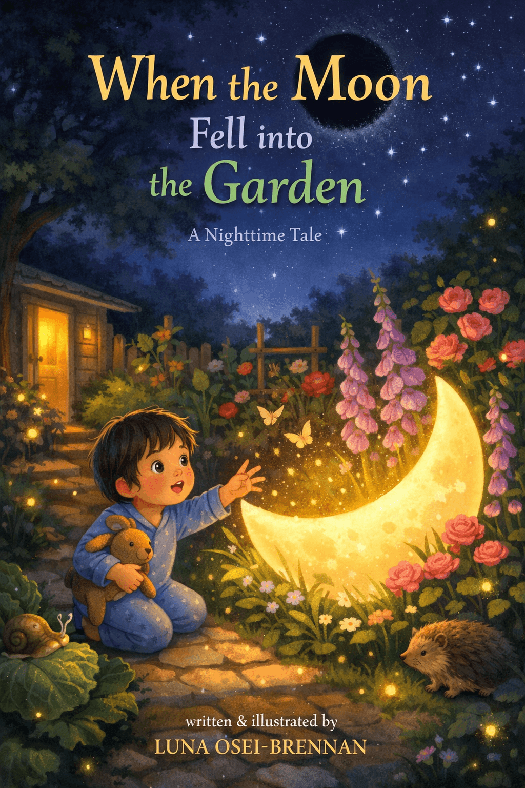
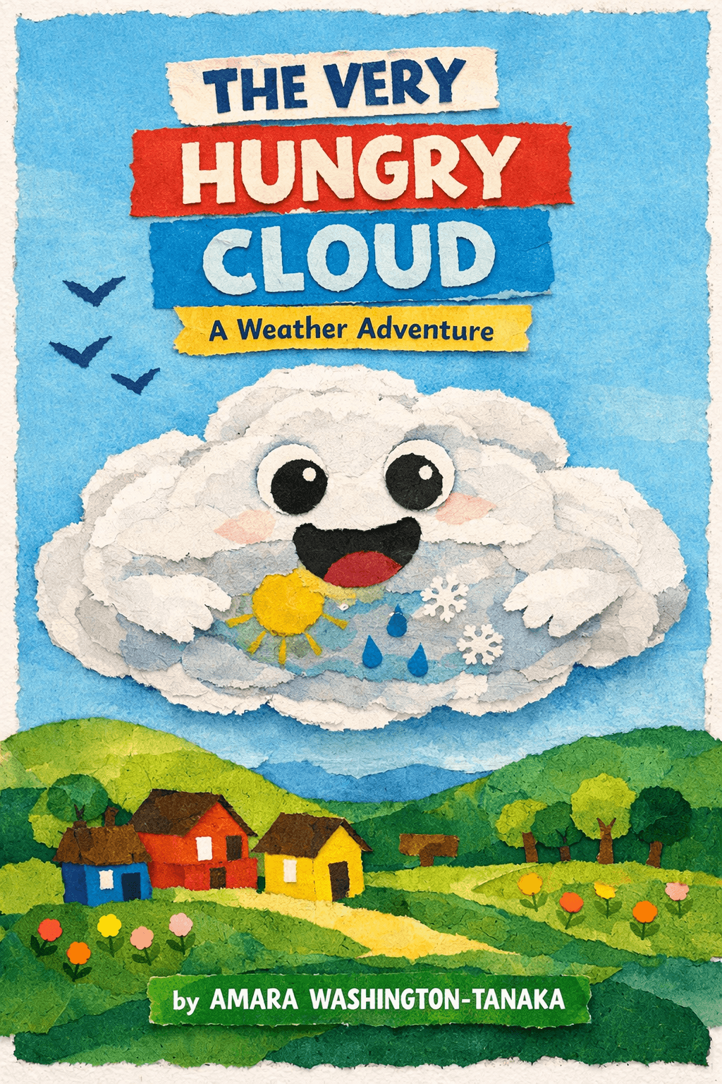
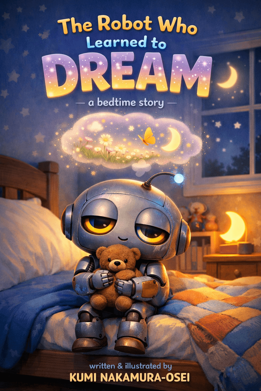
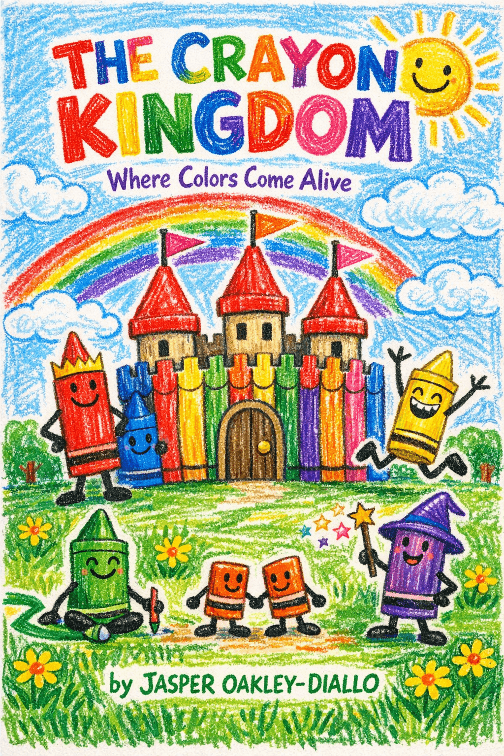
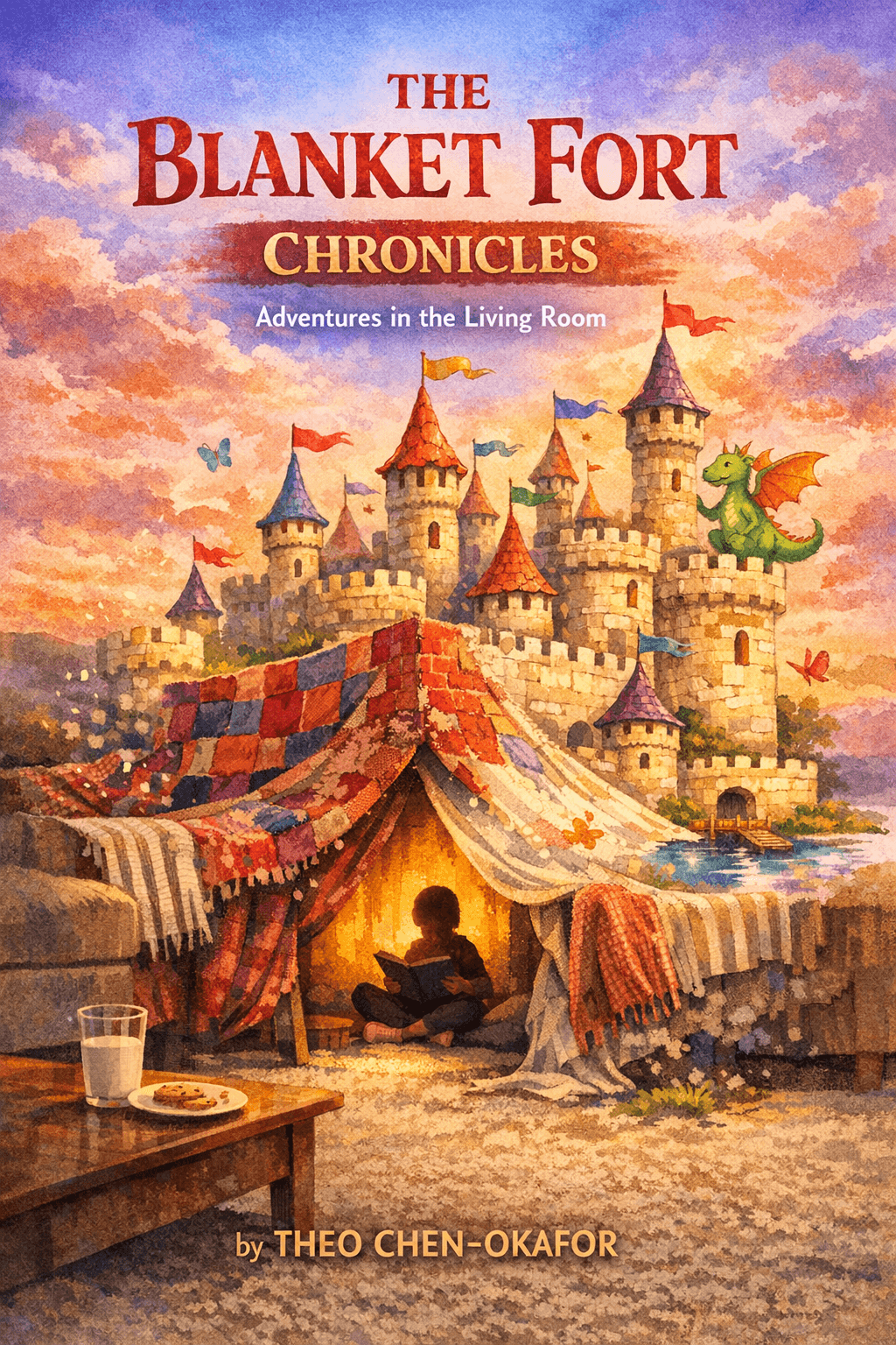
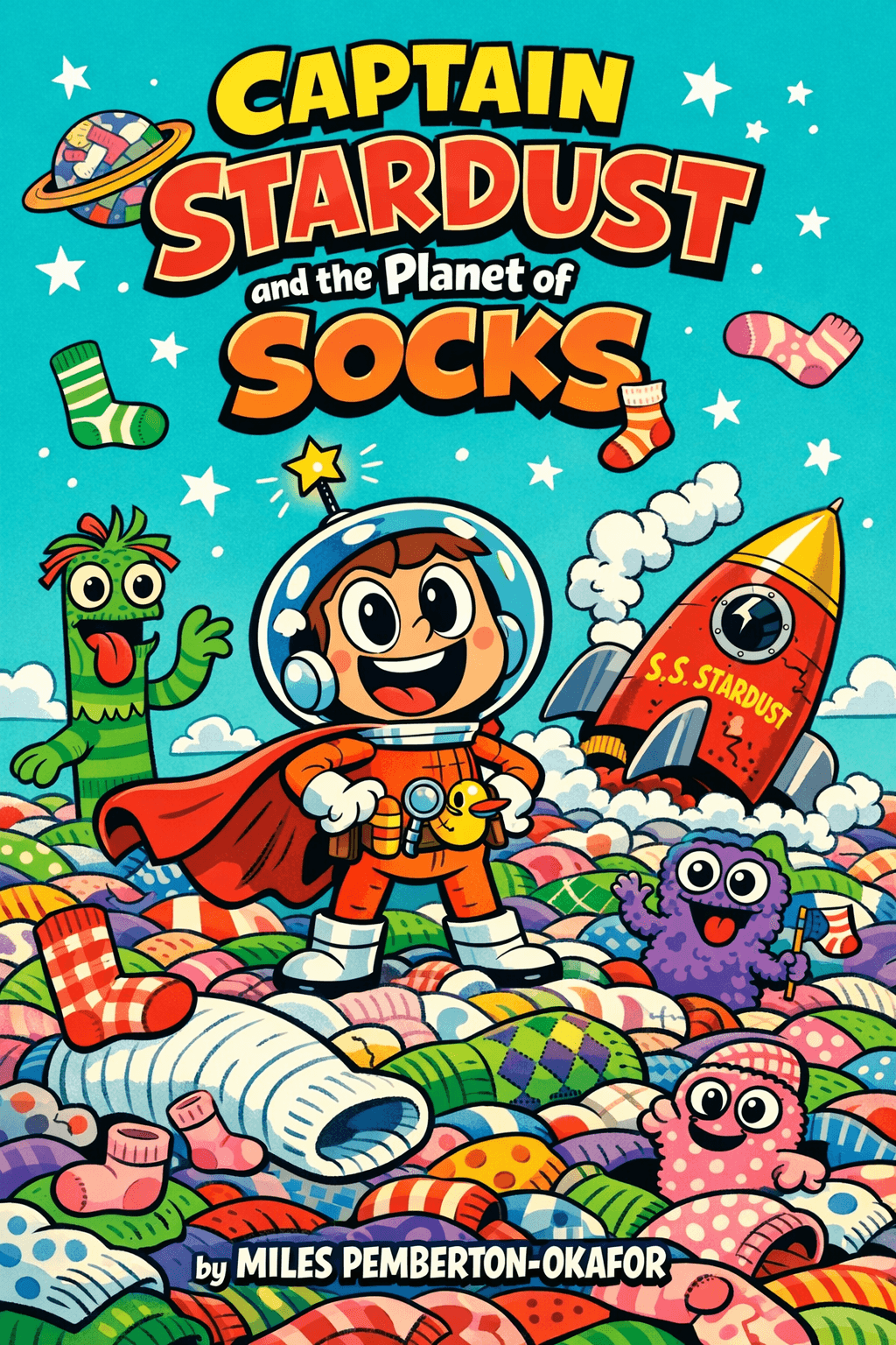
Children's Paperback Cover Examples
Standalone front cover designs for children's ebooks and paperbacks. Each cover uses a distinct art style while maintaining the vibrant, eye-catching qualities that children's books demand.
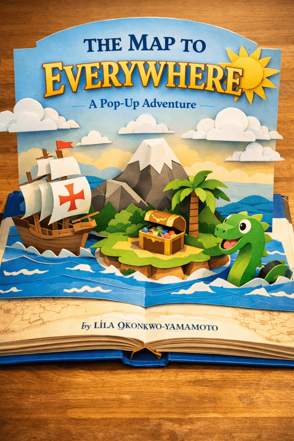
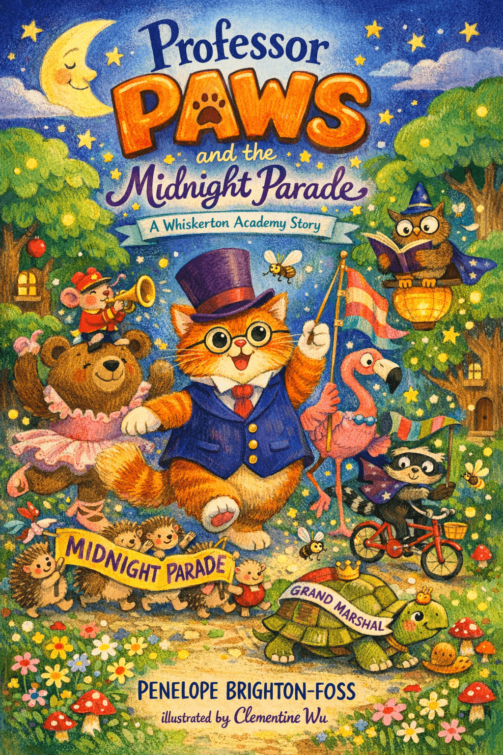
32-Page Illustrated Picture Book Covers
These covers are for full 32-page illustrated picture books — a completely different product from a standalone paperback cover. Each includes consistent character illustrations across every page.